At Intuit, I focused on enhancing, unifying, and scaling the company’s design systems to support consistent, efficient, and delightful product experiences across platforms. My contributions spanned maintaining core libraries, collaborating with product design teams, and improving library usability through a customer-centric, scalable strategy.
The Challenge
Intuit’s design ecosystem was fragmented across multiple libraries and platforms. Teams struggled with:
- Outdated and inconsistent components.
- Fragmented or incomplete documentation.
- Navigational challenges in finding and consuming design libraries.These pain points slowed down workflows, confused designers and developers, and reduced adoption.
My Core Focus Areas
- Maintaining Libraries (Web, iOS, Android)
I ensured that platform libraries were current, scalable, and aligned with evolving design standards.
Actions:
- Updated and enhanced design system components to meet modern workflows.
- Authored comprehensive documentation, including pixel measurements, accessibility notes, and interaction guidelines.
- Partnered with developers to validate feasibility and refine components.
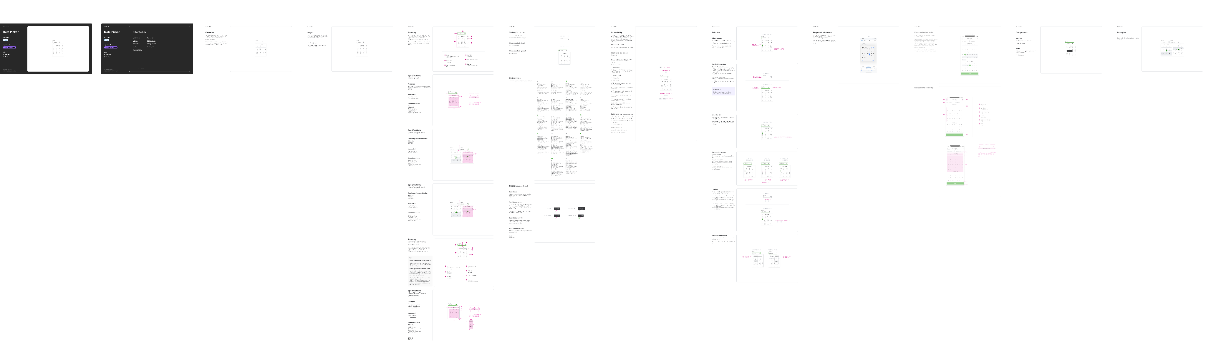
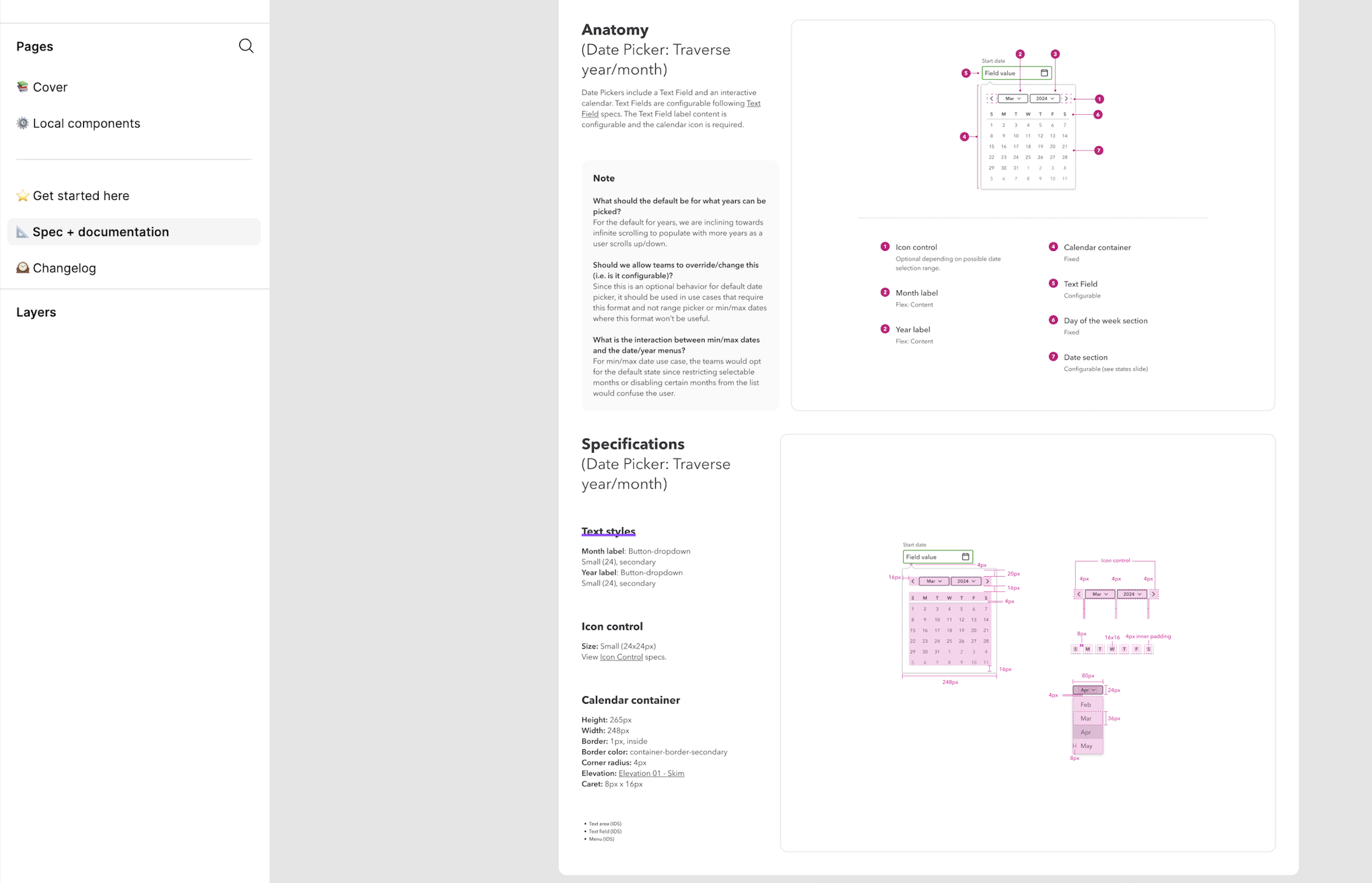
Example: I created end-to-end documentation for the Date Picker component. It included component anatomy (Text Field, Calendar Container, Month & Year labels), localization guidelines, accessibility behaviors, and annotated diagrams for quick reference. The intuitive structure and technical depth helped designers adopt it and enabled developers to implement with confidence.Impact:
- Reduced inefficiencies caused by outdated or unclear patterns.
- Improved adoption by making libraries usable and reliable across platforms.
- Strengthened consistency of UI patterns across Intuit’s product suite.
Sage platform: User journey mapping to understand the touchpoints
2. Collaborating with Product Design Teams
I partnered with product team designers to close gaps where system components didn’t fully support unique product flows.
Actions:
- Identified required patterns and designed new, reusable components aligned with system principles.
- Created modular, flexible structures to ensure scalability across product contexts.
- Produced detailed guidelines and production-ready documentation to support development.
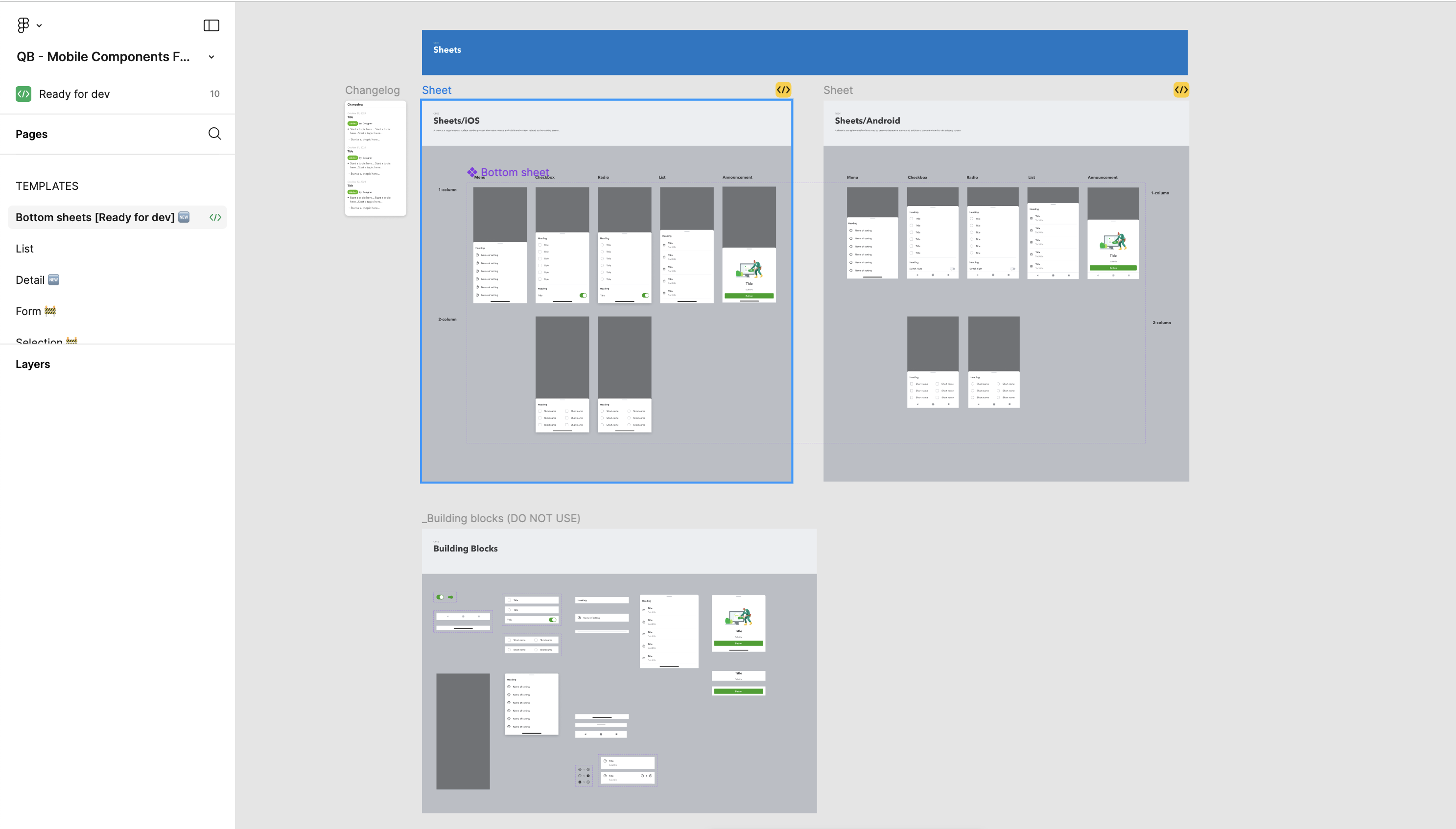
Example: I designed and documented Bottom Sheets for iOS and Android, supporting variations like Menu, Checkbox, Radio, List, and Announcement. The modular structure gave teams flexibility while maintaining cross-platform consistency. Documentation included assets, usage examples, and change logs to simplify adoption.Impact:
- Enabled product teams to move faster by eliminating the need to build ad-hoc solutions.
- Improved collaboration between designers and developers, reducing rework and handoff confusion.
- Extended the design system to support diverse product experiences.
Sage platform: User journey mapping to understand the touchpoints
3. Enhancing Consumption of Design Libraries
To increase adoption, I optimized how design libraries were structured and presented.
Actions:
- Reorganized libraries in Figma for intuitive navigation.
- Advocated and implemented filters, search, and logical component categorization.
- Engaged in continuous feedback cycles with designers and developers to address navigation and discoverability issues.
Impact:
- Streamlined workflows by reducing time spent searching for components.
- Increased library adoption across teams.
- Elevated clarity and usability for both designers and developers.
My Core Focus Areas
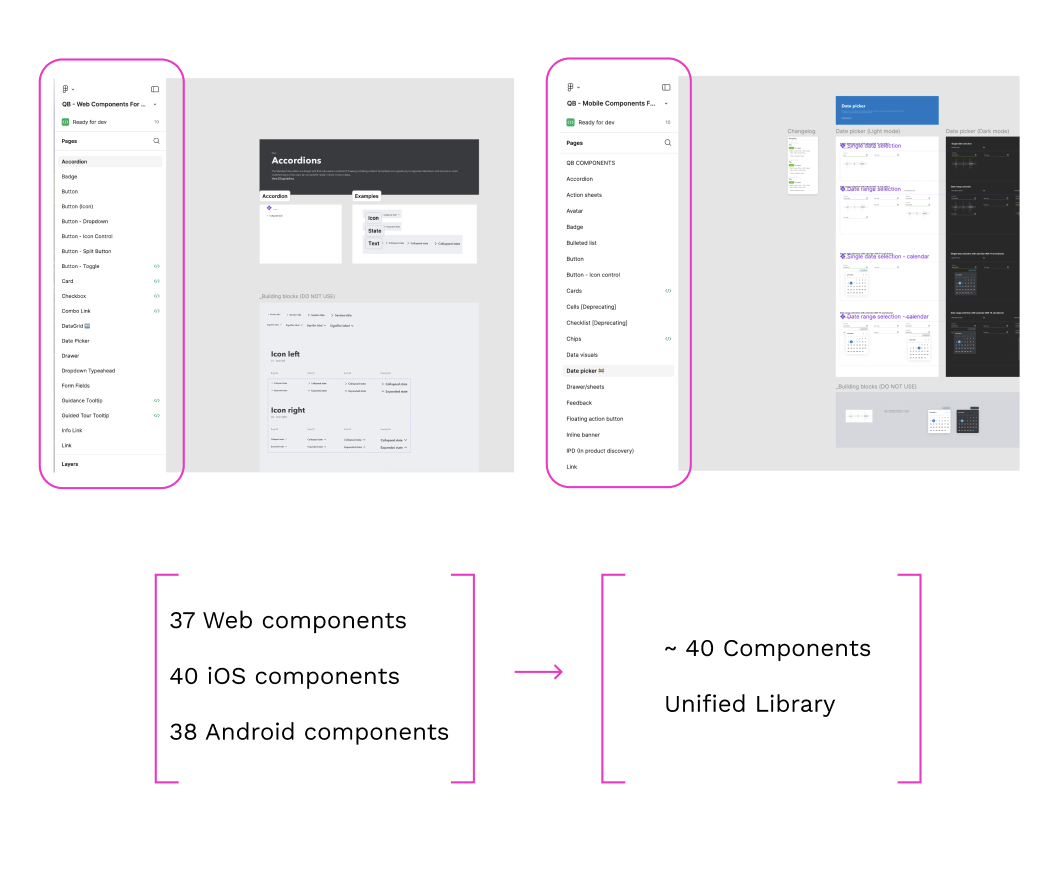
The Library Unification Project
GoalCreate a single, cohesive source of truth spanning Web, iOS, and Android to resolve inconsistencies, streamline workflows, and improve scalability.
Final Solution
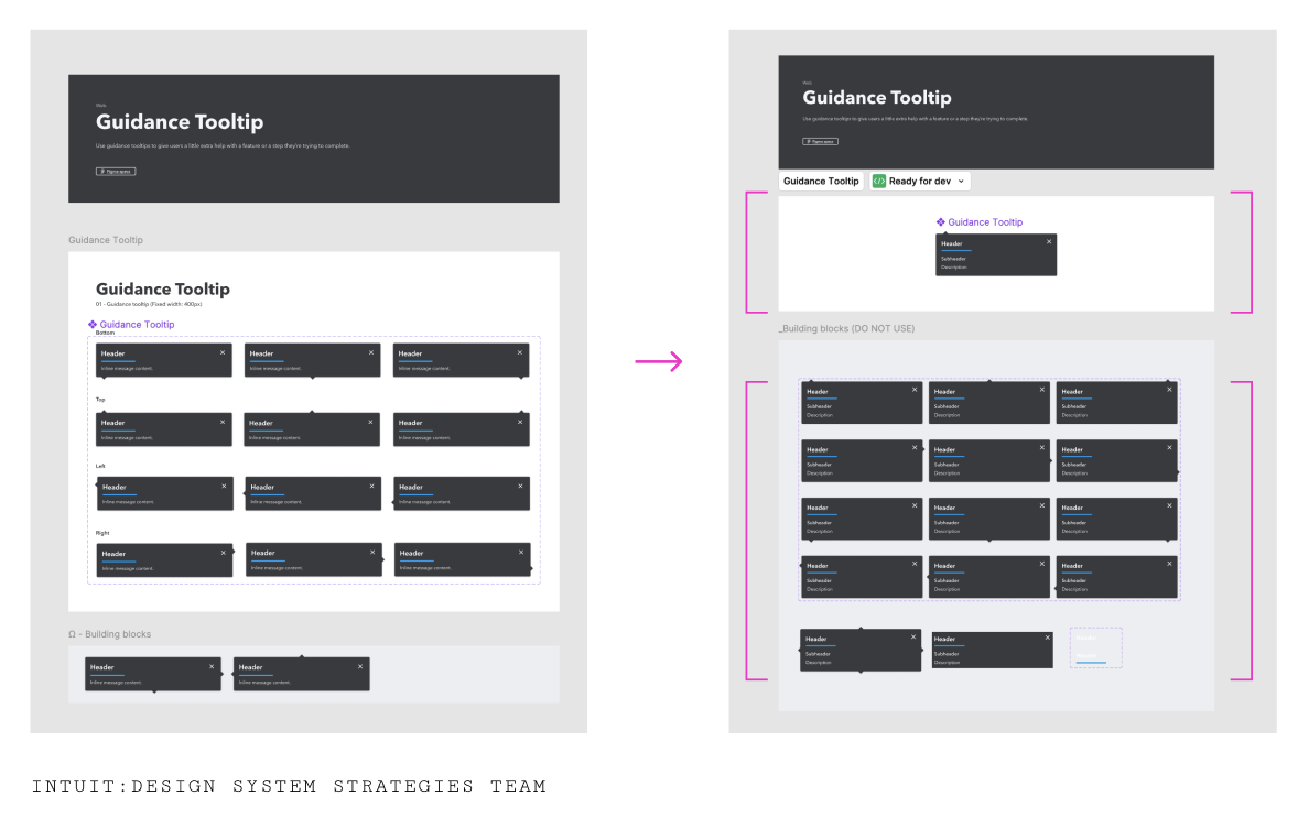
- Centralized Index Page: Provided a quick-glance overview of all components, with filters and search functionality.
Process
- Research: Conducted interviews with designers and developers to uncover pain points. Findings included difficult navigation, inconsistent naming conventions, lack of cross-platform alignment, and outdated patterns.
- Ideation: Facilitated brainstorming sessions to propose solutions like a centralized index page, simplified navigation, and cross-platform rebuilds.
- Iteration: Built wireframes for navigation flows and early prototypes for the unified library index. Redesigned test components for cross-platform reliability.
- Testing: Conducted usability tests to validate navigation clarity and consistency of component behaviors.
- Cross-Platform Components: Rebuilt components to function seamlessly across Web, iOS, and Android while retaining platform nuances.
- Robust Documentation: Delivered technical specifications, implementation notes, annotated diagrams, version tracking, and ready-to-use assets.
My Approach to Design System Strategy
- Customer-Centric: Regularly gathered feedback from designers and developers to address real-world pain points.
- Iterative & Collaborative: Refined designs through continuous feedback loops and cross-functional collaboration.
- Attention to Detail: Ensured cohesive aesthetics, clear documentation, and adherence to accessibility standards throughout every component.
Key Learnings
a. A unified, customer-focused design system reduces duplication and enables efficiency at scale.
b. Consistent documentation and cross-platform compatibility are critical for adoption.
c. Continuous iteration and feedback loops ensure the library remains relevant, usable, and durable.
This unification not only resolved immediate fragmentation challenges but also established a durable, user-centered framework for Intuit’s future design system growth.
More projects
Sagetap
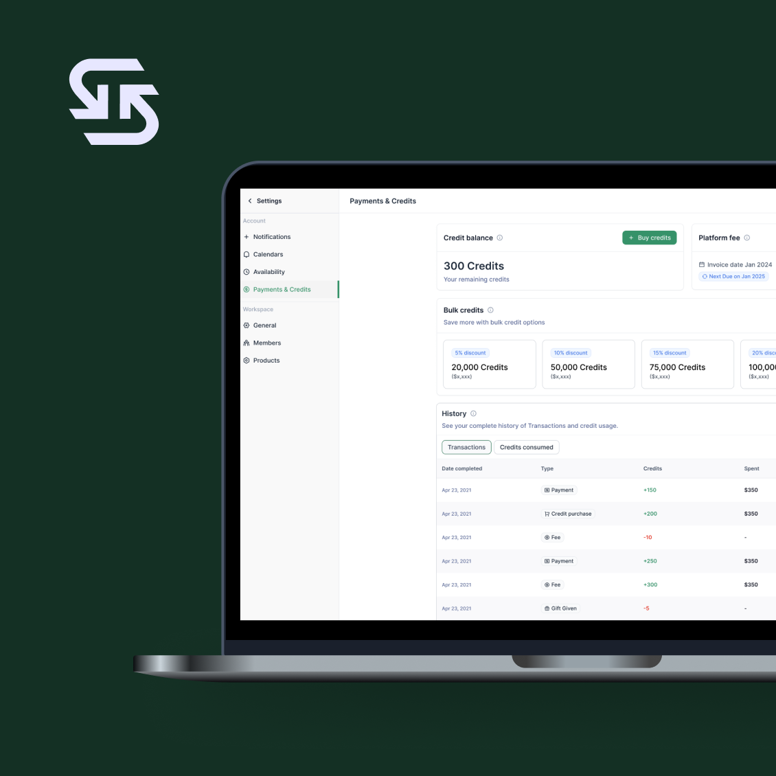
Sagetap: Pay portal design
Explore
Sagetap
Onboarding Redesign: Personalization & Goals
Explore