LibraryThing: App Redesign

Redesigning LibraryThing to simplify navigation and cataloging while creating a more engaging experience.
Overview
THE HOME FOR YOUR BOOKS.
The LibraryThing app allows members to catalog and browse their collections. LibraryThing is focused on books, but you can add most media, including books, DVDs and CDs.
Problem statement
LibraryThing, a book cataloging app, faced issues with:
1. An outdated and cluttered interface.
2. Limited customization options.
3. A complex, tedious cataloging process.
Design Research
COMPETITORS: LibraryThing’s main competitors are Goodreads, Litsy, and BookBuddy. Goodreads has strong social features but a cluttered interface, while Litsy excels in sharing but lacks robust cataloging. BookBuddy offers easy cataloging but limited social interaction. LibraryThing stands out for its detailed cataloging but needs improvements in social engagement and design.
REVIEWS AND SOCIAL MEDIA: User reviews criticize LibraryThing’s outdated interface and complex navigation, but praise its strong cataloguing capabilities. Many want easier organization and more customization. A design refresh and simplified navigation would significantly enhance user experience.

USER INTERVIEWS: Interviewees consistently highlighted the need for better customization, quicker access to core features, and a modern, intuitive interface. Sejal and Rachana expressed frustrations with the app’s outdated design and complex navigation, desiring smoother user flows and improved usability.
Overall, users want a refreshed interface that enhances functionality and user engagement.
Findings
🟢 Users can efficiently catalogue and manage large collections of books and media.
🟢 Useful for organizing and maintaining personal libraries for avid readers
🔴 The app has an outdated interface.
🔴 The functions that the app provides needs to be carried out in a simplified manner than it does now.
🔴 The book collection needs to be more personalised for the user by giving more categorizing/sorting options.
🔴 The apps need to be more engaging with the user by giving more searching and sharing features.
Pain Points

Personas


.jpg)
FINAL DESIGNS
Logo
I started by modernizing the logo while maintaining brand recognition.

Homepage
✅ Improved visual organization of functions.
✅ Simplified navigation bar with intuitive icons.
✅ Enhanced overall visual appeal, reducing clutter and confusion.
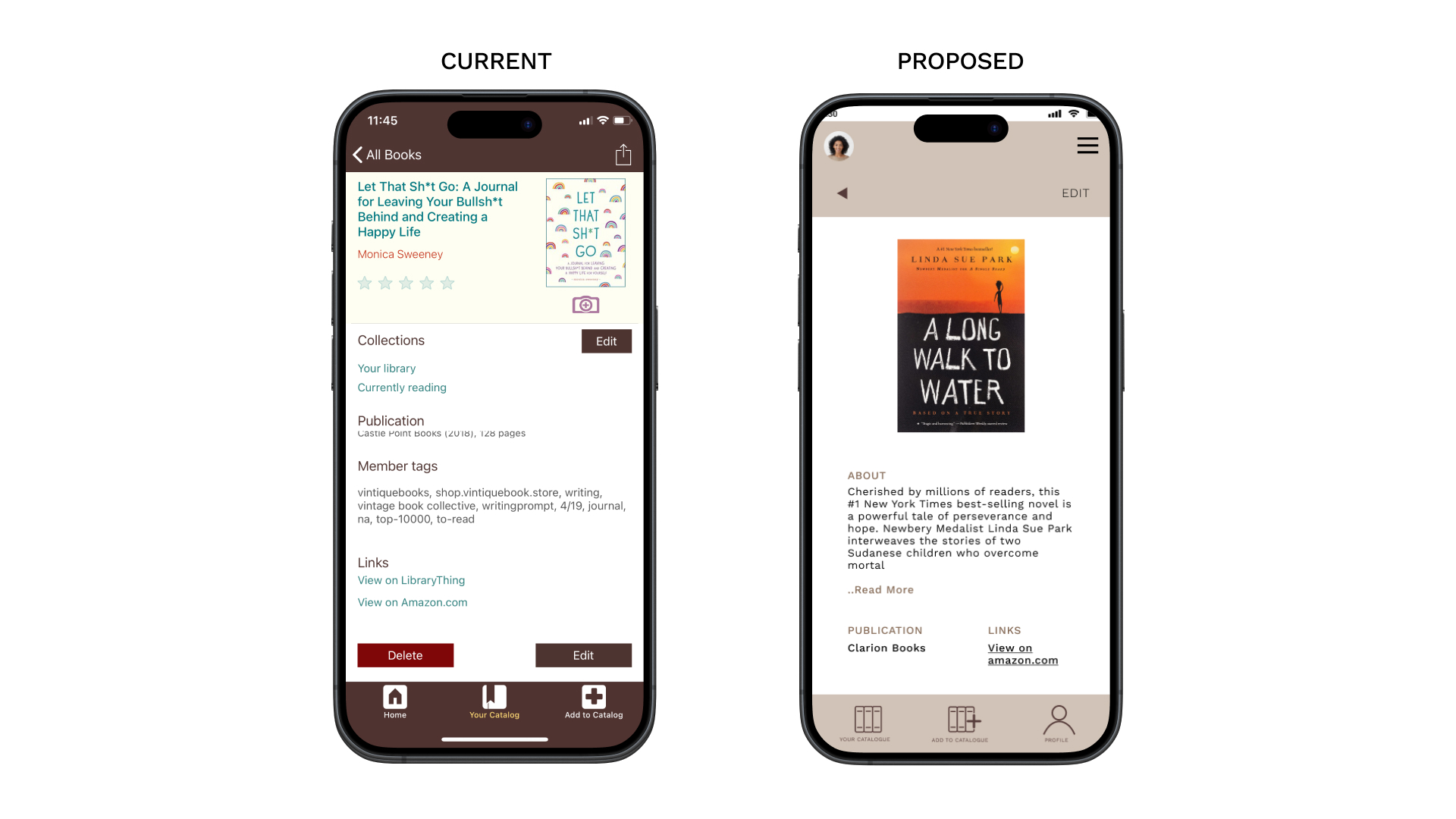
Book Description page
✅ Decluttered layout for easier information access.
✅ Minimalistic design to avoid overwhelming users.
Creative Process
The redesign was rooted in collaborative exploration:
1. Discovering Pain Points: Conducted in-depth user interviews and competitor research to uncover issues like complex navigation and limited personalization.
2. Sketching Concepts: Started with low-fidelity sketches to reimagine the homepage, cataloging workflows, and search features.
3. Rapid Prototyping: Iterated designs with user testing sessions, identifying the most intuitive layout for users.
4. Design Refinement: Experimented with color schemes, typography, and visual hierarchies to achieve a clean, modern look.
Results
The redesign rejuvenated LibraryThing with a fresh, user-focused interface:
1. Enhanced User Experience: Navigation and cataloging workflows were simplified, providing a smoother and more enjoyable app experience. Reduced cataloging time by 30%
2. Improved Aesthetic Appeal: The modern design and cohesive visual elements resonated with users, aligning with their expectations of a book-focused app.
3. Boosted Engagement: The introduction of interactive features, such as personalized catalog options, fostered a deeper connection with the app.
4. Better Brand Perception: The updates presented LibraryThing as a competitive, user-friendly platform for book enthusiasts.
Conclusion
1. Iterative testing and user feedback are crucial for a successful redesign.
2. Simplifying the design process improves overall user experience.


